Deconstructing the USDA’s new food plate
I attended the launch of the new food icon this morning, and the press conference following it (which featured Red Rooster chef Marcus Samuelson).
As USDA Secretary Tom Vilsack explained, we have an obesity crisis in America that imperils our nation’s national security, economic vitality, and health care system. It’s time for action.
I got a preview of the design on a conference call last week (while I was in Spain) and took a screen shot:
This may not look much like action, but it is a sharp departure from previous USDA icons (which USDA has delightfully put online). These mostly emphasize the importance of meat and dairy foods (the 1992 Pyramid was an exception, which was why the Bush II USDA got rid of it).
Before yawning, consider its strengths:
- It is easy to understand (as Mrs. Obama explained, even a child can use it).
- Vegetables comprise the largest sector.
- Together, vegetables and fruits are half the plate.
- You can put whatever foods you like on that plate.
- You don’t have to count servings or worry about portion size (if the plate isn’t too big).
- Dairy foods–a discretionary group–are off to the side.
My one quibble? Protein. I’m a nutritionist. Protein is a nutrient, not a food. Protein is not exactly lacking in American diets. The average American consumes twice the protein needed. Grains and dairy, each with its own sector, are important sources of protein in American diets.
Why protein? USDA used to call the group “meat” even though it contained beans, poultry, and fish. The meat industry ought to be happy about “protein.” Meat producers have spent years trying to convince Americans to equate meat with protein.
And USDA says its consumer testing (as yet unpublished) indicated that the public understood “protein” to cover diverse food sources.
According to William Neuman’s report in the New York Times, USDA official Robert C. Post said that:
U.S.D.A. had spent about $2 million to develop and promote the logo, including conducting research and focus groups and creating a Web site. Some of that money will also be used for the first year of a campaign to publicize the image.
I would like to see that research. Post told me that the research would be published on the website within the next few days. I look forward to seeing it.
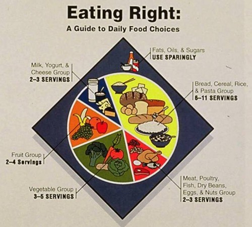
One other point: consider the alternative. Just for fun, here’s the plate the USDA was considering in its last efforts to try to get rid of the Pyramid in 1991. We have Marian Burros, then at the New York Times, to thank for rescuing the Pyramid that came out in 1992.
The next step, of course, is to bring agricultural policy in line with the plate, meaning doing a much better job of supporting producers of vegetables and fruits. This is part of Secretary Vilsack’s plan for repopulating and revitalizing rural America—a goal that I strongly support.
Given the pushback against public health that is happening in Congress this week—Cut school lunches! Cut WIC! Get rid of nutrition recommendations! Go easy on tobacco and antibiotics!—the more I think it took courage for USDA to do this.
Let’s hope USDA can stand up to the heat.


