The USDA has produced four infographics on its purchasing practices for school meals.
- USDA Foods in Schools – This infographic summarizes nationwide USDA Foods purchases including the average cost per pound by food group and the breakdown of total spending and pounds received by food group.
- USDA Foods in Schools: Summary by Program – This infographic shows a summary of purchases from all three programs: USDA Foods Bulk for Processing, USDA Foods Direct Delivery, and USDA DoD Fresh. It is important to note that the USDA Foods Bulk for Processing section only includes items classified as a bulk product on the USDA Foods Available List.
- USDA Foods in Schools: State Overview– This infographic shows the average number of products ordered by States and the top five products by dollar value and volume. This infographic also displays the value of food orders by State.
- USDA DoD Fresh in Schools – This infographic provides an overview of USDA DoD Fresh purchases including a summary of the top five fruit and vegetables received and the total pounds purchased. It is important to note that the items available through USDA DoD Fresh may vary by State.
I took a look at the first one and got stopped cold by this:
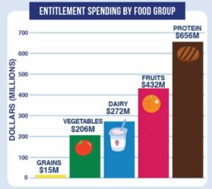
Protein? What’s that? The answer: meat, poultry, fish, eggs, peanut butter, and sunflower seed butter.
I also wondered what DoD Fresh was about. It is an agreement between USDA and the Department of Defense to supply fresh fruits and vegetables to schools.
For school food aficionados, there is much information here in a readily accessible format. Enjoy!