This session is on Practicing Food Studies. It will be at 5;00 p.m. Details to come.
USDA recalculates distribution of food dollar
USDA has changed the way it reports the country’s annual expenditures on the food system. It has just released the Economic Research Service’s new food dollar report. As the report explains, it is designed to answer the question “For what do our food dollars pay?”
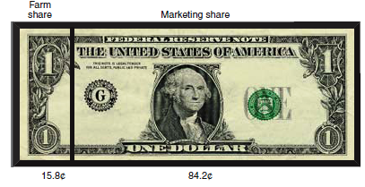
The USDA has a nifty way of presenting this information. The first illustration identifies the distribution of the U.S. food dollar between farm and marketing shares. The farm share is what goes to the farmer. The marketing share is everything else that happens to a food between harvest and consumption.
What surprised me about this was the 15.8% farm share. For those of you who keep track of such things, it was 19% in 2006.
But the USDA changed the methods for computing this figure. Using the new methods, 15.8% is a 4% increase since 2006. However this is calculated, less than 20 cents of a dollar spent on food is for the food itself.
The second illustration explains the distribution of the food dollar among ten industry groups involved in the supply chain.
Looking at the actual data series this way, farm and agribusiness accounts for only 11.6% of the dollar. The big sectors are food processing (18.6%) and food service (33.7%).
From a health and sustainability standpoint, isn’t there something wrong with this picture?


