
Information and program are here. My session:
USDA researchers produce lots of data and sometimes summarize it all in handy charts.
Here are three examples:
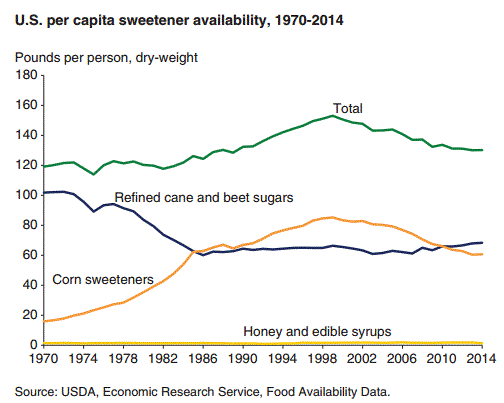
2. How sweet is the food supply? Less than it was in 2000 but more than in 1990. Most of this can be explained by the decline in consumption of sugar-sweetened beverages.
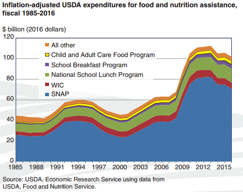
3. What happening with food assistance? The peak in federal spending for all of the programs came a few years ago, but the amounts are now declining. SNAP is the big one—about $75 billion last year.
Ag policy in snapshots. More to come.
