
I’m on the visionary panel. To register, click here.

The USDA has just issued a report on trends in per capita food availability from 1970 to 2014.
Here’s my favorite figure:
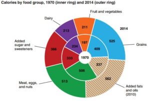
The inner ring represents calories from those food groups in 1970. The outer ring includes data from 2014.
The bottom line: calories from all food groups increased, fats and oils and the meat group most of all, dairy and fruits and vegetables the least.
The sugar data are also interesting:
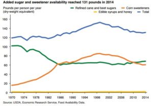
Total sugars (blue) peaked at about 1999 in parallel with high fructose corn syrup (orange). Table sugar, sucrose, has been flat since the 1980s (green).
Eat your veggies!
I’m on the visionary panel. To register, click here.
