Food Politics

by Marion Nestle
Jun 3 2011

Everybody loves MyPlate. Really?

I’ve been collecting public reactions to MyPlate, not least because I’m quoted in many of them.

The USDA collected supportive blurbs from a wide ranging group of supporters (mine among them)

Weight Watchers saluted the new icon in a full-page ad in the Washington Post

The Los Angeles Times covered it (I’m quoted)

The New York Times covered it (I’m quoted)

The Washington Post covered it (I’m quoted)

The Journal of the American Medical Association (JAMA) covered it (I’m quoted)

The New York Daily News covered it (I’m quoted)

The Des Moines Register covered it (I’m quoted)

USA Today covered it and published a photo of the plate with not-quite-fitting food models (I’m quoted)

ObamaFoodorama covered the many restrictions on using the plate (I’m quoted)

FoodNavigator.com covered it, focusing on the protein issue (I’m quoted)

Marian Burros wrote about it for Rodale (I’m not quoted).  She points out:

First of all, the complexities of good nutrition haven’t disappeared. You can find some of them at ChooseMyPlate.gov. And there are factors contributing to obesity—the unhealthy practices of the food industry, the presence of obesogens in the environment, an unsustainable food system to name a few—that won’t go away just because the pyramid is gone.

The American Heart Association supports it.

The American Dietetic Association supports it:

As we have in past years, the American Dietetic Association was deeply involved in the development of the 2010 Dietary Guidelines. And we will use the Guidelines and the new MyPlate to provide the unequalled advice and services of registered dietitians to individuals and communities alike.

Unsurprisingly, the produce industry loves it, according to The Packer and the trade association, United Fresh.

The meat industry spins it (MeatPoultry.com):

We are pleased that the new food icon unveiled today…affirms in a clear and simple fashion that protein is a critical component of a balanced, healthy diet….Lean meat and poultry products are some the most nutrient rich foods available, are excellent sources of complete protein, iron and zinc and maintain an excellent nutrition per calorie ratio.

Amber Healy of Food Chemical News (the site is only open to subscribers) has collected a bunch of food industry responses.  Here are some excerpts:

Jeane Wharton, executive director of the U.S. Dry Bean Council, couldn’t be more delighted with Thursday’s news.  “Beans are a great protein, and they’re also a vegetable,” says Wharton, who observes that her industry’s product benefits twice from the new image.

The American Bakers Association joined in with their praise of the plate, especially for grains “appropriately occupying a large portion on the dinner plate,” which shows that the agencies responsible for nutrition advice “are making a strong statement regarding the importance of grains as the foundation of a healthy lifestyle.

The National Dairy Council, National Milk Producers Federation, International Dairy Foods Association and Milk Processor Education Program (MilkPEP) also praise the new image in a statement released Thursday. While dairy isn’t included on the plate directly, the importance of dairy products in a healthy diet is clear, they say.

“Dairy foods are rightfully being recognized — from the school house to the White House — as an important part of everyone’s diet,” says Jerry Kozak, NMPF’s president and CEO. “USDA’s new icon, with a simple visual metaphor of a serving of dairy products alongside a plate, says it’s vital to consume three servings of low-fat and fat-free dairy foods every day.” [Really?  Vital?  That’s not how I read it.]

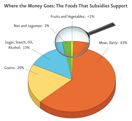
Last but not least, Andy Bellatti in his Small Bites blog and Melanie Warner on BNET provide excellent analyses of the disconnect between MyPlate recommendations and current agricultural policies—both coming from the same, historically schizophrenic USDA.

You think “schizophrenic” is too harsh?  The Physicians Committee for Responsible Medicine explains why agricultural policy needs a fix.



Jun 2 2011

Deconstructing the USDA’s new food plate

I attended the launch of the new food icon this morning, and the press conference following it (which featured Red Rooster chef Marcus Samuelson).


As USDA Secretary Tom Vilsack explained, we have an obesity crisis in America that imperils our nation’s national security, economic vitality, and health care system.  It’s time for action.

I got a preview of the design on a conference call last week (while I was in Spain) and took a screen shot:


This may not look much like action, but it is a sharp departure from previous USDA icons (which USDA has delightfully put online).   These mostly emphasize the importance of meat and dairy foods (the 1992 Pyramid was an exception, which was why the Bush II USDA got rid of it).

Before yawning, consider its strengths:

  • It is easy to understand (as Mrs. Obama explained, even a child can use it).
  • Vegetables comprise the largest sector.
  • Together, vegetables and fruits are half the plate.
  • You can put whatever foods you like on that plate.
  • You don’t have to count servings or worry about portion size (if the plate isn’t too big).
  • Dairy foods–a discretionary group–are off to the side.

My one quibble?  Protein.  I’m a nutritionist.  Protein is a nutrient, not a food.  Protein is not exactly lacking in American diets.  The average American consumes twice the protein needed.  Grains and dairy, each with its own sector, are important sources of protein in American diets.

Why protein?  USDA used to call the group “meat” even though it contained beans, poultry, and fish.  The meat industry ought to be happy about “protein.”  Meat producers have spent years trying to convince Americans to equate meat with protein.

And USDA says its consumer testing (as yet unpublished) indicated that the public understood “protein” to cover diverse food sources.

According to William Neuman’s report in the New York Times, USDA official Robert C. Post said that:

U.S.D.A. had spent about $2 million to develop and promote the logo, including conducting research and focus groups and creating a Web site. Some of that money will also be used for the first year of a campaign to publicize the image.

I would like to see that research.  Post told me that the research would be published on the website within the next few days.  I look forward to seeing it.

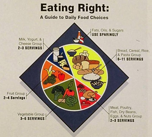
One other point: consider the alternative.  Just for fun, here’s the plate the USDA was considering in its last efforts to try to get rid of the Pyramid in 1991.  We have Marian Burros, then at the New York Times, to thank for rescuing the Pyramid that came out in 1992.


The next step, of course, is to bring agricultural policy in line with the plate, meaning doing a much better job of supporting producers of vegetables and fruits.  This is part of Secretary Vilsack’s plan for repopulating and revitalizing rural America—a goal that I strongly support.

Given the pushback against public health that is happening in Congress this week—Cut school lunches! Cut WIC! Get rid of nutrition recommendations! Go easy on tobacco and antibiotics!—the more I think it took courage for USDA to do this.

Let’s hope USDA can stand up to the heat.


Jun 1 2011

What will USDA’s food plate look like?

According to William Neuman’s report in the New York Times, a USDA official, Robert C. Post, said the new food guide would be a plate and that it would serve educational purposes :

The agency would use the plate to get across several basic nutritional messages, including urging consumers to eat smaller portions, switch to low-fat or fat-free milk and drink water instead of sugary drinks.

A plate with half devoted to fruits and vegetables is not exactly a new concept.

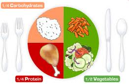
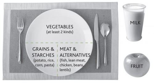
The American Diabetes Association has been using this plate as  a food guide:


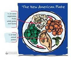
The American Institute for Cancer Research uses this one:


Canada’s food guide is translated into this plate:


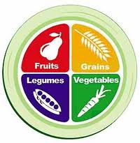
And the Physicians’ Committee for Responsible Medicine has an elegantly designed 100% plant-based plate for vegetarians and vegans:


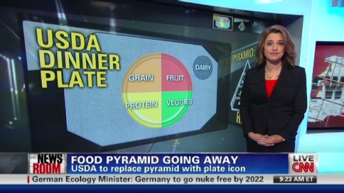
And here’s what CNN thinks the new USDA food icon will look like:


Can the USDA improve on the existing versions?  Does CNN have it right?

I’ll be in Washington tomorrow to find out.  You can be there virtually at www.cnpp.usda.gov.


May 29 2011

MyPyramid R.I.P.

On May 26, the USDA announced that it will be releasing a new “food icon” to replace the foodless and useless 2005 MyPyramid:


The USDA’s press announcement explained:

The 2010 White House Child Obesity Task Force called for simple, actionable advice to equip consumers with information to help them make healthy food choices. As a result, USDA will be introducing the new food icon to replace the MyPyramid image as the government’s primary food group symbol. It will be an easy-to-understand visual cue to help consumers adopt healthy eating habits consistent with the 2010 Dietary Guidelines for Americans.

What will the new icon look like?  The USDA isn’t saying, but William Neuman of the New York Times did some sleuthing.  According to his account:

The circular plate, which will be unveiled Thursday, is meant to give consumers a fast, easily grasped reminder of the basics of a healthy diet. It consists of four colored sections, for fruits, vegetables, grains and protein, according to several people who have been briefed on the change. Beside the plate is a smaller circle for dairy, suggesting a glass of low-fat milk or perhaps a yogurt cup.

And WebMD scored an interview with Robert C. Post, PhD, deputy director of the USDA Center for Nutrition Policy and Promotion, who gave additional hints:

“There will be a ‘how-to’ that will resonate with individuals. That is the behavioral part that is needed. We need to transcend information — ‘here’s what the science says’ — and give people the tools and the opportunities to take action.”

He referred to six how-to messages to guide healthy eating that were released with the 2010 Dietary Guidelines, and which I enthusiastically posted when the Guidelines were released (I was disappointed that they weren’t actually part of the Guidelines):

Balancing Calories

• Enjoy your food, but eat less.

• Avoid oversized portions.

Foods to Increase

• Make half your plate fruits and vegetables.

• Switch to fat-free or low-fat (1%) milk.

Foods to Reduce

• Compare sodium in foods like soup, bread, and frozen meals—and choose the foods with lower numbers.

• Drink water instead of sugary drinks.

A bit of history:

From 1958 until 1979, the USDA’s food guide was sort of a rectangle illustrating four food groups: Dairy, meat, fruits and vegetables, breads and cereals.  In 1979, USDA introduced a highly controversial design with food groups stacked on top of each other, with the plant-food groups at the top and the animal-food groups underneath (the producers of these foods did not like that).

Beginning in 1980, the USDA conducted an extensive research project to develop a new design—the pyramid—which it released in 1991 and withdrew immediately under pressure from meat producers.

In 1992, after a year of extraordinary controversy (recounted in my book Food Politics), the USDA released its highly controversial Food Guide Pyramid.


Why was it controversial?  The food industry objected that the Pyramid make it look as if you were supposed to eat more foods from the bottom of the pyramid than the top (which, of course, was its point).

Nutritionists objected that it encouraged eating too many servings of grains and, therefore, encouraged obesity.

In 2005, the USDA replaced it with the unobjectionable MyPyramid.  The food industry liked this one because it did not indicate hierarchies in food choices.  Most nutritionists that I know hardly knew what to do with it.  It required going online and playing with a website, and was unteachable in clinic settings.

I thought the 1992 pyramid had a lot going for it, particularly the idea that it’s better to eat some foods than others.  But MyPyramid was a travesty–hopelessly complicated, impossible to teach, and requiring the use of a computer.

Given this situation, the new image is highly likely to be an improvement.  If the new icon keeps the hierarchy, conveys concepts easily, and does not require online access, I will consider it a great step forward.

Fingers crossed.

Details about the release:

The announcement will be Thursday, June 2, 10:30 a.m. EDT. It will be live-streamed at www.usda.gov/live.   All information will be posted at www.cnpp.usda.gov.

I’ll be there.  Stay tuned.


Balancing Calories• Enjoy your food, but eat less.

• Avoid oversized portions.

Foods to Increase

• Make half your plate fruits and vegetables.

• Switch to fat-free or low-fat (1%) milk.

Foods to Reduce

• Compare sodium in foods like soup, bread, and frozen meals—and choose the foods with lower numbers.

• Drink water instead of sugary drinks.

May 28 2011

Redesign the Nutrition Facts label? Here’s your chance!

Utne reader has just announced the most interesting contest: redesign the food label.

The contest is sponsored by Good magazine and the UC Berkeley Graduate School of Journalism’s News21 program.  It is called the Rethink the Food Label project.

Anyone can enter.  Just think of some way that would make the label more useful.

The FDA is currently working on doing just that, and for good reason.  The label is so hard to use that the FDA devotes a lengthy website to explaining how to understand and use it.

This too is understandable.  The Nutrition Facts label is the result of regulations in response to the Nutrition Labeling and Education Act of 1990.  When the FDA started writing regulations to implement the Act, it tested consumer understanding of a bunch of potential designs.

The result?  Nobody understood any of them.  The FDA, under pressure to complete the regulations by the congressional deadline, chose the option that was least poorly understood–the best of a bad lot.

Surely someone will come up with something better than this?  The deadline for submission: July 1. One of the judges is Michael Pollan. Give it a try!


May 27 2011

Why I think health claims are about marketing, not health? Gerber’s whey claim

Yesterday’s New York Times displayed a full-page advertisement for Gerber baby food (owned by Nestlé, no relation):

Gerber is taking more than baby steps to reduce the risk of certain allergies

.…The FDA concludes that current scientific evidence is appropriate for consideration of a claim regarding the relationship between the consumption of 100% whey-protein partially hydrolyzed infant formula and reduced risk of atopic dermatitis.

….We’re proud to say that Gerber Good Start is the first and only formula brand made from 100% whey-protein partially hydrolyzed.  In contrast, most other routine milk-based formulas are made with intact cow’s milk protein.

Translation: Some infants are allergic to the proteins (whey) in cow’s milk.  Treating the proteins so they are split apart into smaller fragments (partial hydrolysis) apparently destroys some of their ability to elicit allergic immune reactions in the skin.

But here’s where the ad gets totally weird:

The FDA has concluded that the relationship between 100% whey-protein partially hydrolyzed infant formulas and the reduced risk of atopic dermatitis is uncertain, because there is little scientific evidence for the relationship.  Partially hydrolyzed formulas should not be fed to infants who are allergic to milk or to infants with existing milk allergy symptoms.

Huh?

Blame Congress for this one.  It insists that the FDA allow “qualified” health claims” for which scientific evidence is uncertain.

If you want to know why the FDA can’t seem to get anything done, take a look at what it’s staff had to do to respond to the Gerber petition.  Graduate students take note: this is an exhaustive review of scientific studies on the relationship between hydrolyzed whey protein and infant skin allergies.

Here is the FDA’s conclusion, written in FDA-speak, about Gerber’s petition for a health claim:

In light of the above considerations, FDA intends to consider the exercise of its enforcement discretion for the following qualified health claims (my emphasis):

1. “Very little scientific evidence suggests that, for healthy infants who are not exclusively breastfed and who have a family history of allergy, feeding a 100% Whey-Protein Partially Hydrolyzed infant formula from birth up to 4 months of age instead of a formula containing intact cow’s milk proteins may reduce the risk of developing atopic dermatitis throughout the 1st year of life and up to 3 years of age.”

2. “Little scientific evidence suggests that, for healthy infants who are not exclusively breastfed and who have a family history of allergy, feeding a 100% Whey-Protein Partially Hydrolyzed infant formula from birth up to 4 months of age instead of a formula containing intact cow’s milk proteins may reduce the risk of developing atopic dermatitis throughout the 1st year of life.”

3. “For healthy infants who are not exclusively breastfed and who have a family history of allergy, feeding a 100% Whey-Protein Partially Hydrolyzed infant formula from birth up to 4 months of age instead of a formula containing intact cow’s milk proteins may reduce the risk of developing atopic dermatitis throughout the 1st year of life and up to 3 years of age. FDA has concluded that the relationship between 100% Whey-Protein Partially Hydrolyzed infant formulas and the reduced risk of atopic dermatitis is uncertain, because there is very little scientific evidence for the relationship.”

4. “For healthy infants who are not exclusively breastfed and who have a family history of allergy, feeding a 100% Whey-Protein Partially Hydrolyzed infant formula from birth up to 4 months of age instead of a formula containing intact cow’s milk proteins may reduce the risk of developing atopic dermatitis throughout the 1st year of life. FDA has concluded that the relationship between 100% Whey-Protein Partially Hydrolyzed infant formulas and the reduced risk of atopic dermatitis is uncertain, because there is little scientific evidence for the relationship.”

Why would Gerber’s place a hugely expensive full-page ad in national newspapers to celebrate a decision like this?  Because it knows that any health claim, no matter how poorly substantiated by science, gives it a competitive advantage.

This is reason enough to promote breastfeeding.


May 26 2011

That pesky GMO issue again

The L.A. Times has one of the better stories I’ve seen lately about genetically modified (GM) foods.  I don’t usually write much about this topic because there is so little new to say about it.

I’ve been writing about GM foods for 20 years now and I’d call it a stalemate.  The industry says:

  • GM foods are absolutely necessary to feed the world.
  • Farmers love them.
  • They are harmless.

Farmers do like using them because they do not have to do as many pesticide applications or worry as much about weeds.

But the first and third points are highly debatable, as the article discusses.

I worry most about two aspects of GM foods:

  • They encourage corporate control of the food supply and monoculture (never good ideas)
  • They do not give consumers choices because they aren’t labeled.

The LA Times illustrates both points in one terrific graphic:


The states are starting to act, but this is really the FDA’s issue.  It’s time to get the FDA to reverse its 1994 decision not to label GM foods.


May 24 2011

Do you want calories listed for alcoholic drinks? Tell FDA by July 5

In April, the FDA released proposed rules for listing calories on menu labels (see previous post).  One surprising omission was an exemption for alcoholic beverages.  The surprise was that FDA had included alcoholic beverages in earlier versions.

The FDA’s reason for omitting alcohol is that these drinks are regulated by the Treasury Department, which proposed rules for calories on the labels of such drinks.  Yes it did, but that was at least four years ago and Treasury has done nothing since.  And Treasury has never said a word about menu boards.

Jurisdiction cannot be the real reason.  FDA does not regulate meat and poultry (USDA does) but its proposed regulations cover those foods.

If you think the FDA should require restaurants to display calories for alcoholic beverages, now is the time to say so.

I think consumers’ right to know is a sufficient reason for demanding calorie labeling on alcoholic beverages, but if you want more, the Marin Institute  lists useful talking points.

  • Alcoholic beverages contain calories and few nutrients.
  • It is difficult for drinkers to calculate the number of calories contained in a specific alcoholic beverage on their own.
  • Congress did not explicitly exclude alcoholic beverages from food labeling requirements.
  • The FDA has jurisdiction over the regulation of alcoholic beverages for health purposes.
  • The TTB [Treasury Department agency] continually fails to act regarding the labeling of alcoholic beverages.
  • Exempting small alcohol producers can remove burden of obtaining nutritional information.

If you are convinced by these arguments, or have others of your own, be sure to share them with FDA.  Do it right away.  The deadline is July 5.