by Marion Nestle

Search results: added sugar

Sep 1 2013

“Natural” on food labels? Ain’t necessarily so…

It’s the first Sunday of the month and time for my monthly Food Matters column in the San Francisco Chronicle.  In this one, I deal with the annoying “natural” on food labels, a term that the FDA prefers not to define.

Q: I am doing legislative research on food policy for one of my state’s senators on the definition of “natural.” As things stand, it’s difficult for consumers to understand what “natural” means on food labels. How should the FDA define this term so it is accurate and not misleading?

A: I was traveling in New England when your question arrived, and it sent me right to the nearest Hannaford supermarket. Hannaford makes this research easy. Sections everywhere in the store are labeled “organic and natural.”

Organic is no problem. Certified organic products must be made with ingredients raised or grown without artificial fertilizers, pesticides, hormones, antibiotics, irradiation, sewage sludge or genetic modification.

But what are we to make of Honey BBQ All Natural Potato Chips containing 20 ingredients, among them monosodium glutamate, yellow food color, and undoubtedly genetically modified corn and soy, but “no hydrogenated fats and gluten free”? Or Healthy Natural Dog Food containing meat by-products and other such things but “no artificial preservatives, colors or fillers”?

The Food and Drug Administration is not much help. Its answer: “From a food science perspective, it is difficult to define a food product that is ‘natural’ because the food has probably been processed and is no longer the product of the earth. That said, FDA … has not objected to the use of the term if the food does not contain added color, artificial flavors or synthetic substances.”

If you have made it through all the not’s in this non-definition, you can begin to understand how the FDA can allow high-fructose corn syrup to be “natural.” Even though enzymes, synthetic or not, are required to convert cornstarch to this mixture of glucose and fructose, it does not contain artificial colors or flavors.

But the products I mentioned do. Yellow No. 5 is an artificial color. You must assume that the corn or soy in any “natural” product is genetically modified unless the label says GMO-free or Certified Organic. You may be someone who has a hard time considering GMO ingredients “natural.”

In the last decade, new products marketed with “natural” claims have proliferated, and it’s easy to understand why. Marketers love the term. “Natural” sells products, not the least because consumers consider it a synonym for healthful and, often, for organic. Anyone would rather buy “100 percent natural seltzer water” – “calorie-free, no sugar, no sodium, gluten-free” (things never found in water) – than plain seltzer.

While “natural” does not necessarily mean “healthy” or even “healthier,” it works splendidly as a marketing term and explains why many junk-food manufacturers are switching from expensive organic ingredients to those they can market as “natural.”

The FDA isn’t fixing this situation because, according to a statement in response to a petition by Center for Science in the Public Interest, it’s “not an enforcement priority.”

Manufacturers of highly processed foods could not be happier with this nondecision.

In the absence of regulation, enter litigation. In recent years, advocacy groups have filed dozens of lawsuits seeking to ban “natural” claims on foods containing ingredients that seem unnatural, especially those genetically modified. Judges tend to say it’s the FDA’s problem and are calling on the agency to define the term.

The U.S. Department of Agriculture, which is responsible for meat and dairy products, has attempted to clarify what it means by “natural.” Its Food Safety and Inspection Service says meat and poultry can be labeled “natural” when they are minimally processed and have no artificial flavorings, colorings or preservatives. USDA’s Agricultural Marketing Service says “naturally raised” means the meat must come from animals produced with no hormone growth promoters, no antibiotics and no animal by-products.

How about all of the above? And if the public really can’t tell the difference between “natural” and “organic,” the closer the definition of “natural” is to that of “organic,” the less confused they will be.

Perhaps you could advise the senator to begin with the organic standards. And then toss in working definitions that exclude anything synthetic, artificial and more than minimally processed.

You should expect food industry lobbying against this idea to be fierce. But the public will be better served if the compromises in defining “natural” come at the end of the negotiations rather than at the beginning.

Marion Nestle is the author of “Why Calories Count: From Science to Politics,” “Food Politics” and “What to Eat,” among other books. She is a professor in the nutrition, food studies and public health department at New York University, and blogs at www.foodpolitics.com. E-mail:food@sfchronicle.com

Feb 22 2013

Kellogg’s Scooby-Doo: nutritionally groundbreaking?

Can something like this be nutritionally revolutionary?


Kellogg has just launched this cereal with just 6 grams of sugars per serving—half of what’s in most other cereals aimed at kids.

It’s also lower in sodium, but everything else about it looks pretty much the same:

http://www.kelloggs.com/content/dam/common/products/nutrition/124171.jpg

Will Kellogg put money behind this cereal and market it with the millions it spends to market Froot Loops?   Will it reduce the sugars in its other cereals?  Will other cereal companies do the same?

Or will Scooby Doo suffer the fate of Post’s no-added-sugar and otherwise unsweetened Alpha Bits introduced in around 2005?

http://www.chewonthatblog.com/wp-content/uploads/2012/09/11alphabits.jpg

Post put no money into marketing the cereal and dropped it after just a few months (Alpha Bits now has 6 grams of sugars per serving).

Let’s give Kellogg some credit for giving this a try.   I’ve looked for Scooby Doo in grocery stores but haven’t been able to find it.

I will watch its fate with great interest.

Update: Thanks to Cara for pointing out that with Scooby Doo, Kellogg adds a cereal to its portfolio that meets requirements of the WIC (USDA’s Women, Infants, and Children’s nutritional support program).  As Jessica, a Kellogg rep explains, “The benefit of this cereal is that it’s WIC eligible and boosts several vitamins and minerals, is low in fat, is a good source of fiber and vitamin D and an excellent source of iron.”

And thanks to an anonymous writer for pointing out that Scooby Doo is directly competing with General Mills’ Dora Explorer cereal for the lucrative WIC market, one that should amount to nearly $7 billion in 2013.  WIC specifies what the benefits can be used to buy.  Cereal companies want to be sure they are in that market.

Nov 27 2012

HFCS v. Diabetes: Correlation does not mean causation.

The latest study on the evils of High Fructose Corn Syrup (HFCS) so annoys the Corn Refiners Association that it broke the study’s embargo.

Reporters were not supposed to write about the study until today, but the Corn Refiners issued a press release yesterday: “Caution: New Study Alleging HFCS-Diabetes Link is Flawed and Misleading.”

The New York Times quickly posted its own pre-embargo account.

Why the fuss?  The study reports that countries with the highest levels of HFCS in their food supplies also have a 20% higher prevalence of diabetes in their populations.  This is a correlation between HFCS and diabetes.  It does not mean that HFCS causes diabetes—an important distinction.

But the authors’ press release (sent to me in an e-mail message) makes it sound like causation.  They say (also see Dr. Goran’s comments added to this post below):

HFCS appears to pose a serious public health problem on a global scale,” said principal study author Michael I. Goran…The study adds to a growing body of scientific literature that indicates HFCS consumption may result in negative health consequences distinct from and more deleterious than natural sugar.

This conclusion is based on their observations that the amounts of other sugars in the food supplies of countries with high and low HFCS are about the same.  But HFCS is a form of sugars that adds to total sugar availability.

The authors obtained information about diabetes and obesity prevalence and HFCS and other dietary factors in the food supply from existing sources of data, all of them questionable.   The data do not distinguish between type 1 and type 2 diabetes, for example, and the two different sources of data on diabetes prevalence give different results.

Inconsistencies abound.  For example, Mexico has more diabetes than does the U.S., but rather low HFCS availability (Mexicans prefer sucrose in their sodas).  Some countries with high diabetes rates report no HFCS availability at all.

As with all correlational studies, something else could be going on that causes HFCS, sugars of all types, and diabetes to increase.

That was the point I was trying to make when I spoke to Stephanie Strom of the New York Times:

 “I think it’s a stretch to say the study shows high-fructose corn syrup has anything special to do with diabetes,” Dr. Nestle said. “Diabetes is a function of development. The more cars, more TVs, more cellphones, more sugar, more meat, more fat, more calories, more obesity, the more diabetes you have.”

She noted that the study “falls right in the middle of the Corn Refiners fight with the Sugar Association,” a reference to the legal war being waged between the two industry groups over the marketing of high-fructose corn syrup.

The Corn Refiners press release quotes its president, Audrae Erickson:

This latest article by Dr. Goran is severely flawed, misleading and risks setting off unfounded alarm about a safe and proven food and beverage ingredient.  There is broad scientific consensus that table sugar and high fructose corn syrup are nutritionally and metabolically equivalent…The bottom line is this is a poorly conducted analysis, based on a well-known statistical fallacy, by a known detractor of HFCS whose previous attack on the ingredient was deeply flawed and roundly criticized.

Whew.

Yes, HFCS is sugar(s)—glucose and fructose.  So is table sugar (sucrose).

But the bottom line goes for both: Everyone would be better off eating less sugar(s).

Addition to post: Dr. Goren wrote two e-mails to me in response.  With his permission, they follow.

Hi Marion,

I saw your comments in the NYT article that was published about our global HFCS paper.

You say that: “Diabetes is a function of development. The more cars, more TVs, more cellphones, more sugar, more meat, more fat, more calories, more obesity, the more diabetes you have.”

I wanted to mention that an often overlooked issue is that obesity is not the only factor contributing to type 2 diabetes and even the causal link between obesity and type 2 diabetes is unknown. Other factors include inflammation, oxidative stress, insulin resistance etc. In the study that was done with my colleague at the University of Oxford, the countries with high and low/zero HFCS were matched for obesity levels as well as total calorie and sugar availability. In essence this allowed us to isolate the effects of HFCS as a contributing factor, independent of obesity and the other factors that you mention that are related to obesity. I agree, as stated in the paper, that the ecological type analysis has its limitations, but in the case of HFCS it provided an opportunity to study its effects at the broader macro level. We did this because it is impossible to evaluate individual levels of HFCS consumption because we don’t know specifically how much is added to food/beverages.

The main critique of our study from the corn refiners association is based on their assertion that fructose and glucose are the same when in fact its textbook knowledge that their metabolic fate/pathways are very different. The CRA now says that sucrose and HFCS are “almost identical”. Almost identical acknowledges that they are different in some way which they are. Its a fact that HFCS-55 has at least 10% more fructose than sucrose and our prior study in which we analyzed popular beverages showed this was on average 20% and in some cases as much as 30% higher fructose. The key question in my mind is whether the additional fructose in HFCS is enough (even if its only 10% higher) to tip the balance towards the negative metabolic effects of fructose on health. This is at the heart of the issue and should be the focus of investigation. Our study, with its accepted limitations, adds to the growing body of evidence that the additional fructose coming from HFCS may indeed be enough to tip this balance.

His second message:

Thanks for responding, and yes, I’d be pleased if you added this to your blog –  – I think this will be a good addition. The question of whether the extra 10% fructose matters is indeed critical.

We also by the way did analyze total sugars versus diabetes in a much larger data set of 200 countries but the reviewers asked for that to be taken out which we did because we also thought the focus on HFCS would be unique. We also did see a clear relationship between total sugar and diabetes – some of that relationship was mediated by obesity but there also was an independent association between total sugars and diabetes. So, I agree – – both obesity and total sugars contribute to diabetes – – but I also believe, as shown in our paper, that HFCS has a separate link, and that this is probably due to the higher fructose content in HFCS.

Also, you mentioned in your blog that the different estimates of diabetes gave different results. That’s not really correct. The estimates of diabetes were different from each other, but regardless of which diabetes estimate we used, we still found a consistent association between HFCS and the 2 prevalence estimates of diabetes as well as fasting glucose. So in essence the results were validated using different prevalence estimates of type 2 diabetes.

Jul 12 2012

My latest letter from lawyers: VITAMINWATER®

I’ve been away for the last couple of weeks, and am just getting to accumulated mail.  I was surprised to find a letter dated June 18 from Angela Wilson, an attorney at Parks IP Law, a limited liability firm specializing in intellectual property rights.

In her letter, which you can read here in its entirety, Ms. Wilson writes:

We represent Energy Brands Inc., a wholly-owned subsidiary of the Coca-Cola company.  Recently, we noticed that Food Politics used the term “vitamin Water” in the article, “New York Plans to Ban Sale of Big Sizes of Sugary Drinks,” which appeared in the June 4, 2012 edition of your publication (see attached).

I’m confused.  The article attached to the letter is my post, “Weight of the Nation: the new “Hunger in America”?, a June 4 reprint of a column I wrote for the San Francisco Chronicle.  It does not refer to “vitamin Water.”

Foodpolitics.com contains an excellent search engine.  I searched my posts for “New York Plans to Ban….”   No post with that title exists.   I looked at posts about Mayor Bloomberg’s proposed ban on large sodas.  My post about the soda initiative contains plenty of references to Coca-Cola, but says nothing about “vitamin Water.”

A search for “vitamin water” turns up 17 posts, the most recent in 2011.  The most relevant is an account of a class-action suit filed against Coca-Cola by the Center for Science in the Public Interest arguing that “Vitamin Water makes sugary drinks that promote obesity but positions these products as healthful because they contain added vitamins and herbs.”

Never mind.  Let’s focus on the matter at hand.  Attorney Wilson’s letter continues:

It appears that the article may have been referring to our client’s VITAMINWATER® brand, but because Food Politics used the phrase “Vitamin Water,” that may not be clear to your readers.  Accordingly, we write to request that your writers [sic] refer to our client’s trademark properly in future stories. [I used sic because I’m the only writer on this site.]

Her letter suggests that I follow some simple guidelines when referring to her client’s trademark.  You might enjoy reading the entire list for yourself, but here’s a short summary:

  • DO distinguish our client’s VITAMINWATER® trademark as one word (without a space in the middle) and in all capitals or italics
  • DO add the registration symbol (“®”)
  • DO follow all references to our client’s trademark with the words “enhanced water”
  • DON’T use terms such as “vitaminwater,” “vitamin water,” or “vitamin waters”

Ms. Wilson’s letter concludes: “When you use our client’s name correctly, you help protect the integrity of their [sic] innovative enhanced water product.”

[Why sic?  I’m a professor and can’t help this sort of thing.  “Client” is singular; “their” is plural.  Nouns and pronouns should agree.]

I can only imagine the enormous fees that Parks IP Law and Angela Wilson must be getting from Coca-Cola to get me to refer more precisely to its trademarks.

I’ll try.  I promise.

Oct 14 2011

“Better-for-you” products better for food industry? Only if they can be marketed as such.

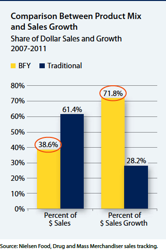
A study released yesterday reports that so-called “better-for-you” (BFY) foods (those low in salt and sugar, high in fiber or with added vitamins, for example) may account for only about 40% of company sales, but they account for more than 70% of growth in sales.

Hudson Institute, October 2011

According to the press release accompanying the report, companies that sell BFY products “record stronger sales growth, higher operating profits, superior shareholder returns, and better company reputations than companies that sell fewer BFY products.”

The public health implications?  According to the report:

  • Placing more emphasis on selling BFY foods and beverages is an effective pathway to improved sales, profits, shareholder returns, and reputation.
  • Proof that bottom lines can benefit when companies have a greater percentage of sales from BFY foods could accelerate progress toward the development and marketing of more nutritious foods.
  • Public health officials and policymakers need to be aware of food and beverage companies’ core business goals in order to work effectively with them to address the obesity epidemic.

I emphasize the third one because it sounds so much like a veiled threat.

I think it means that if public health officials want the food industry to make healthier food products, they better let food companies market their products any way they like:

  • To children with no restrictions
  • Using cartoons on packages of products aimed at children
  • Using health claims with no restrictions
  • Using front-of-package labels that emphasize “good-for-you” nutrients

Or else.

Or else what?  Just watch what the food industry will do (and is doing) whenever public health officials try to restrict advertising to children or demand that that companies put nutritional “negatives” on front-of-package labels.

Here’s CNN Health’s account (I’m quoted) and the one in the Wall Street Journal (I’m not).

Jun 5 2011

San Francisco Chronicle column: food plate, of course

My monthly (first Sunday) San Francisco Chronicle Food Matters column is on guess what?  This will be the last post on the new food icon for a while at least, I promise.

Food plate icon improvement of pyramid


Q: What’s the big deal over the government’s new food icon? A plate? That seems really boring.

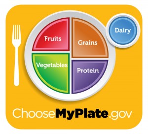
A: The Department of Agriculture’s plate may look banal, but it is a key part of first lady Michelle Obama’s healthy eating campaign and I see it as a big step forward. Unlike the 2005 MyPyramid, this one is mostly about food, is easy to understand, and does not require use of a computer.

The plate does a better job of reflecting current thinking about healthy diets than previous guides. Its four sectors are unequal. Vegetables get the most space, and dairy – a discretionary choice – is off to the side.

You are to pile half your plate with fruit and vegetables, and a quarter with grains (half of them whole grains). All these come from plants.

I’m less happy about the sector marked “protein.” Protein is not a food. It is a nutrient.

USDA must think everyone knows that “protein” means beans, poultry and fish, as well as meat. But grains and dairy, each with its own sector, are also important protein sources. The meat industry wants you to equate protein with meat. It should be happy with this guide.

What I like best are the messages that come with the plate. My favorite? “Enjoy your food, but eat less.”

At last! Enjoyment is part of dietary advice. High marks to USDA for this one.

Other messages are designed to help you eat less while eating better. Smaller portions keep calories under control. Making half your plate fruits and vegetables is a profound switch from the six to 11 calorie-rich grain servings you were supposed to eat daily under the old MyPyramid.

For people who drink milk (really, you don’t have to), switching to low-fat is an effective way to save on calories, and whole grains are better for health than refined, rapidly absorbable starches that behave like sugars in the body.

So far, so good. But next come the politically charged “foods to reduce.” Here, the USDA is leaning in the right direction, but still pulling punches. USDA tells you to reduce sodium from soup, bread and frozen meals, but says nothing about salty snacks or other sodium-laden processed foods. This is a glaring omission.

And the final principle – “drink water instead of sugary drinks” – puts naturally sweet fruit juices (fine in small amounts) in the same category as sugar-added juice drinks, sports drinks and sodas, which ought to be reserved for occasional treats.

Let’s give USDA credit for going as far as it could without directly confronting the processed-food and soft-drink industries.

Optimist that I am, I think the icon has plenty for everyone to work with. It emphasizes the positives – fruits, vegetables, whole grains – and leaves lots of room for enjoyment. You can pile whatever foods you like on that plate as long as they fit within their assigned sectors.

Best of all, you do not have to count numbers of servings. If you want to control the size of your servings, just use a smaller plate.

Consider the alternatives. From 1958 until 1979, the USDA’s uncontroversial Four Food Groups advised eating two or three servings a day from dairy, meat, fruits and vegetables, and breads and cereals – half the plate from animal-source foods.

In 1979, in an effort to help reduce dietary risks for chronic diseases, USDA stacked the groups with plant foods above animal foods, eliciting a furor that led USDA nutritionists to begin a 12-year project to research a new food guide.

USDA released a food guide Pyramid in 1991, withdrew it under protest from meat producers, and re-released it a year later. Meat and dairy producers did not like being at the “eat less” top of the Pyramid. Nutritionists thought it promoted too many servings of high-calorie grains.

In 2005, the USDA replaced that Pyramid with the unobjectionable, food-free MyPyramid. This was impossible to teach (you had to know what each color stood for), eliminated any sense that it is better to eat some foods than others, and required a computer to personalize your own diet.

USDA officials say they spent about $2 million to research and test the new plate logo, create its website, and publicize it. This is a lot or a little depending on your perspective, but a plate is not exactly a new concept. The American Diabetes Association, American Institute for Cancer Research and Canadian government have all used similar plant-focused plates for years. The Physicians Committee for Responsible Medicine has one with a similar design but 100 percent vegetarian.

We can argue over nutritional details, but I think USDA’s plate-plus-messages works better than anything it has done before. The plate works for health and for disease prevention. It took courage to make half of it fruit and vegetables. That’s real progress.

Now the challenge is to Congress: How about fixing agricultural policies so they support these recommendations?


The Department of Agriculture's new food-plate icon is an...The Department of Agriculture's new food-plate icon is an...The Department of Agriculture's new food-plate icon is an...

Jan 25 2011

“Singing Kumbaya,” GMA/FMI displays preemptive label design

I listened in on the conference call at which the Grocery Manufacturers of America and the Food Marketing Institute announced their new Nutrition Keys design for front-of-package labels.

My favorite comment: We are all “singing kumbaya” here.  Nutrition Keys, they said, was the result of a” monumental, historic effort” in which food companies “stepped up to the plate in a big way,” “with 100% support.”

Why did they go to all this trouble?  Because “A healthy consumer makes for a happy consumer.”

Kumbaya, indeed.

The real reason, as I explained yesterday, is to preempt the FDA’s front-of-package food labeling initiatives which might make food companies reveal more about the “negatives” in processed foods.

Here’s what GMA and FMI say the new label will look like:

Four of these things are required: Calories, Saturated fat, Sodium, and Total (not added) sugars.  Packages can also display up to two “nutrients to encourage” picked from this collection:  protein; fiber; vitamins A, C, and D; and potassium, iron, and calcium.

Let’s give these food trade associations credit for listing sugars instead of the Institute of Medicine’s recommendation for trans fat.  Trans fats are already gone from most processed foods.  Everyone cares about sugars.  But these are total sugars, not added sugars, which is what really matters.

And protein?  Since when does protein need to be encouraged in American diets?  We already eat twice the protein we need.  The rationale?  Vegetarians.   I repeat.  Since when don’t vegetarians get enough protein?  Never mind, protein makes the products look better.

Nutrition Keys merely repeats what’s on the Nutrition Facts labels, only worse.  It makes the percent Daily Values practically invisible.  Which is better?  High or low milligrams or grams.  You have to know this, and Nutrition Keys doesn’t help with that problem.

Nutrition Keys, says the industry, is about “more clarity in labeling.”  Really?  Here’s what it will look like on a food package.

I’ve been collecting reactions.

Although GMA and FMI insist they they are doing this in response to the First Lady’s Let’s Move campaign, the White House issued this statement:

The White House, including the First Lady, recognizes these companies for the leadership they have shown in advancing this initiative. We regard their commitment to dedicate space, for the first time, to an industry-wide front-of-pack label as a significant first step and look forward to future improvement. The FDA plans to monitor this initiative closely and will work with experts in the field to evaluate whether the new label is meeting the needs of American consumers and pursue improvements as needed. We will continue to work on seeking solutions for the problem of childhood obesity in America.

Congresswoman Rosa DeLauro was more forthcoming:

The industry’s unveiling today of its front-of-package labeling system is troubling and confirms that this effort should not circumvent or influence FDA’s effort to develop strong guidelines for FOP labels.

Given that negative and positive nutrients will not be differentiated on the package, there is significant risk that these labels will be ignored.  An adequate labeling system must clearly alert consumers about potentially unhealthy foods, and should not mislead them into believing that some foods are healthy when they clearly are not.

Reporters asked tough questions on the conference call about preemption of FDA efforts to do front-of-package labeling in a rational way (see my post from yesterday).  Perhaps space limitations made full accounts impossible:

Jan 24 2011

Forget FDA. Grocery trade groups to do their own “better-for-you” logos

The Grocery Manufacturers Association (GMA) and the Food Marketing Institute (FMI) are announcing their “Nutrition Keys” plan for front-of-pack (FOP) nutrition labels.  Their member companies have agreed to display calories and percent of saturated fat, trans fat, and sodium, per serving, on the front of product packages.

So far, so good.

But they also will be displaying up to eight “positives,” nutrients that are supposed to be good for you.  They say they will be using some kind of design similar to what some companies are using now, only with “positives” added.

Note: this illustration comes from Mars (the company, not the planet).  It is not what GMA and FMI will necessarily use.

Let me repeat what I wrote last October when GMA and FMI first said they intended to do this:

Forget the consumer-friendly rhetoric.

There is only one explanation for this move: heading off the FDA’s Front-of-Package (FOP) labeling initiatives.

In October, the Institute of Medicine (IOM) released the first of its FDA-sponsored reports on FOP labels.  Based on research on consumer understanding of food labels and other considerations, the IOM committee strongly recommended that FOP symbols only list calories, sodium, trans fat, and saturated fat.

This led William Neuman of the New York Times to summarize the IOM approach as: “Tell us how your products are bad for us.”

GMA and FMI would much rather label their products with all the things that are good about them, like added vitamins, omega-3s, and fiber.  If they have to do negatives, they prefer “no trans fat” or “no cholesterol.”

What they especially do not want is for the FDA to impose “traffic-light” symbols.  These U.K. symbols, you may recall from previous posts, discourage consumers from buying anything labeled in red, and were so strongly opposed by the food industry that they caused the undoing of the British Food Standards Agency.

GMA and FMI, no doubt, are hoping the same thing will happen to the FDA.

At the moment, the FDA is waiting for the IOM’s second report.  This one, due in a few months, will advise the FDA about what to do about FOP labels—again based on research.  Couldn’t GMA and FMI wait?

From what I’ve been hearing, GMA and FMI could not care less about the IOM or FDA.  This is what they had to do to get member companies to agree.  They say the new labels will go on about 70% of branded products by next year.  They also say they will spend $50 million on public education.

How this will play out in practice remains to be seen.  You can bet that plenty of highly processed foods will qualify for “positives,” just like they did with the industry-initiated Smart Choices logo, may it rest in peace.

As I said in October: This move is all the evidence the FDA needs for mandatory FOP labels.   GMA and FMI have just demonstrated that the food industry will not willingly label its processed foods in ways that help the public make healthier food choices.

Let’s hope the GMA/FMI scheme flunks the laugh test and arouses the interest of city and state attorneys general—just as the Smart Choices program did.

The official announcement is coming this afternoon.  Stay tuned.

Addition: Scott Obenshaw, Director of Communications for GMA files the following clarification:

1.)     In addition to the information regarding calories, saturated fat, sodium and total sugars content, the Nutrition Keys icon on some products will display information about two “nutrients to encourage.”  The two nutrients to encourage that may appear on some products as part of the Nutrition Keys icon must come from the following list: potassium, fiber, vitamin A, vitamin C, vitamin D, calcium, iron and also protein.  These “nutrients to encourage” can only be placed on a package if the product has more than 10% of the daily value per serving of the nutrient and meets the FDA requirements for a “good source” nutrient content claim.

2.)     Transfat is not part of the label – only calories, saturated fat, sodium and total sugars content.

Let’s give GMA and FMI lots of credit for replacing the IOM’s recommendation for trans fat with sugars.  Trans fats are heading out of the food supply and consumers want to know about sugars.  So that’s an improvement.  And two positives might not overwhelm the so-called negatives.  But I’m eager to see what the design really looks like and will report as soon as it is released.