Front-of-package label designs: Which one works best?
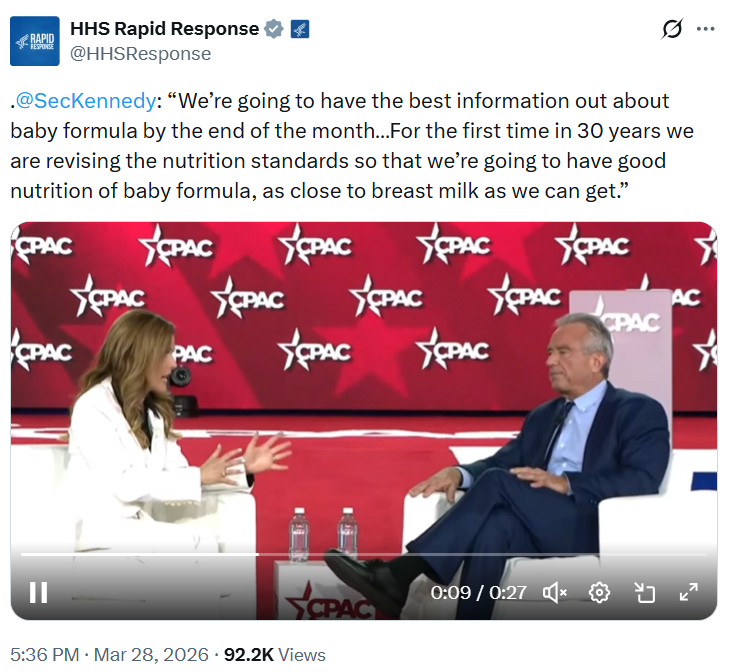
RFK Jr has promised that we will soon ahve a new front-of-package label.. As soon as they define ultra-processed foods,
Every food in your grocery store will have a label on it,” Kennedy told [Joe] Rogan. “It’ll have, maybe, a green light, a red light, or a yellow light telling you whether or not it’s going to be good for you.”
This has been in the works for a long time, as I’ve written previously. The FDA’s original version did not have colors so we don’t know yet what this might look like.

But which of the many possible designs is likely to be most effective? We now have the answer to that question: Efficacy of front-of-package nutrient labels designed for mandatory implementation in the USA: an online randomised controlled trial.
The study asked particicpants to identify products with the most and least healthful nutrition profiles from among these designs.
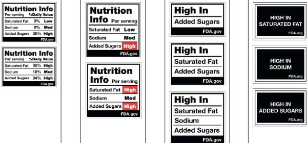
The clear winner: The last column (“multi-high-in-label), which greatly outperformed the ones like what the FDA is proposing.
The winning label helped participants
- Identify healthy products
- Avoid interpreting unhealthy foods as healthy
- Recall label contents
The obvious interpretation: Use the winners.
These, by the way, are much like those used in Chile, Mexico, and other Latin American countries, with much evidence for effectiveness.
Resources
- Open-access Article: https://www.thelancet.com/journals/lancet/article/PIIS2468-2667(26)00027-7/fulltext
- Link to article and Appendix
- Press release: https://www.ucdavis.edu/news/new-research-suggests-fda-should-consider-redesign-proposed-nutrition-labels
- Lancet PH Podcast: https://www.buzzsprout.com/1793453/episode_players/18876284